Best practices
What—and what not—to do when creating branded merchandise.
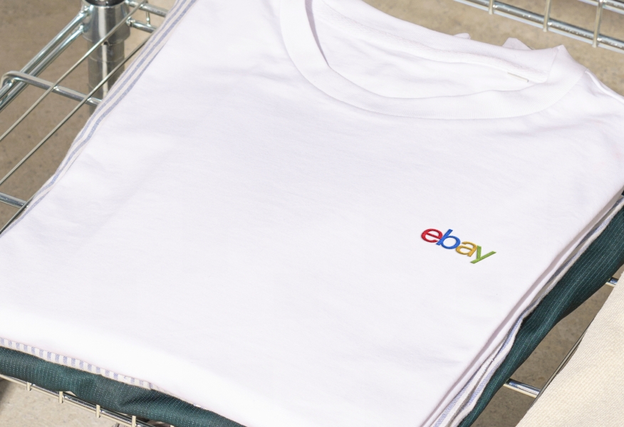
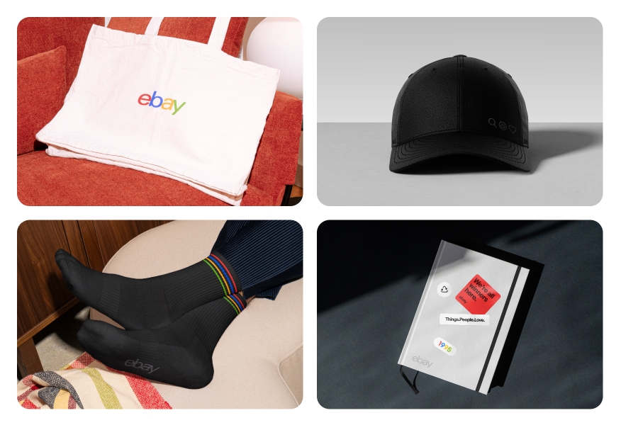
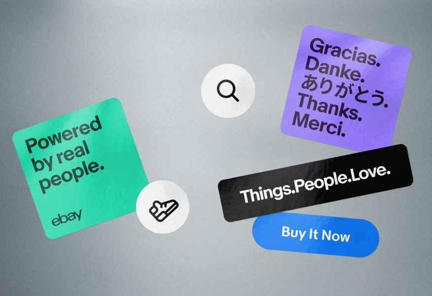
Do use either our 4-color, black, or white logos on black or white merchandise.
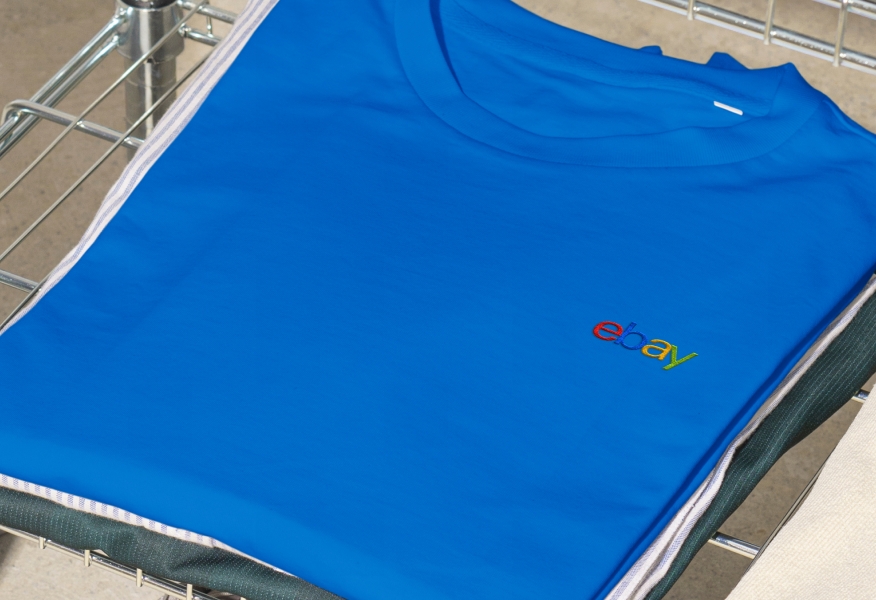
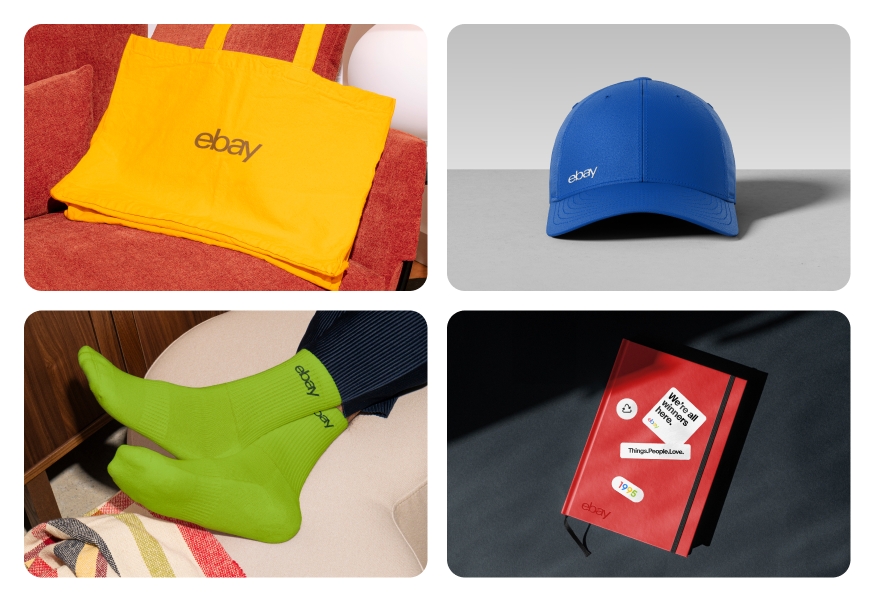
Don’t use our 4-color logo on colored merchandise.
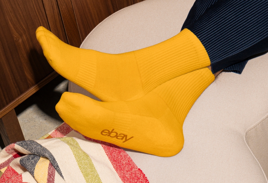
Do choose merchandise that is as close to our heritage colors as possible.
Don’t use merchandise colors that deviate from our heritage colors.
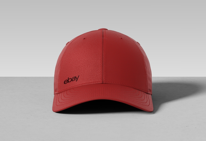
Do use predetermined tone-on-tone color combinations.
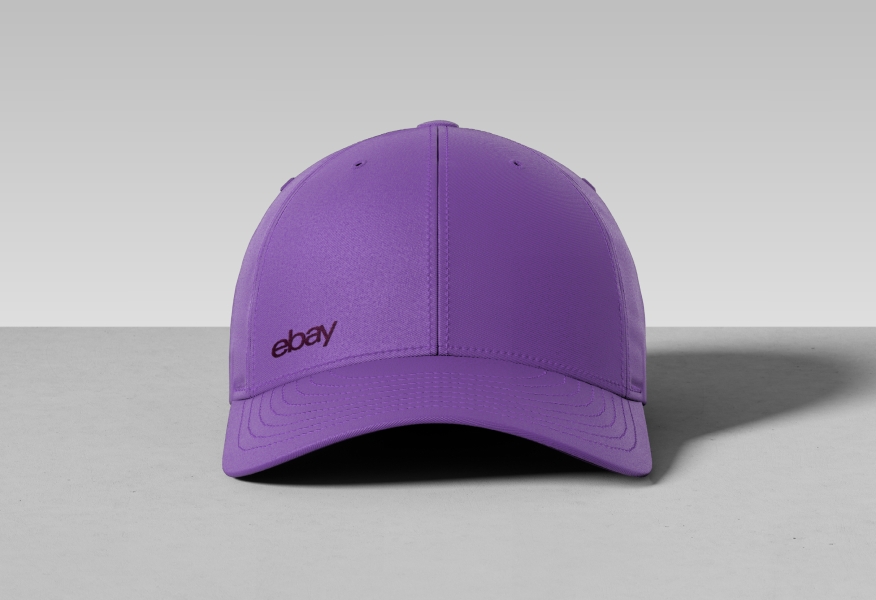
Don’t combine color families.

Do use tonal logos and incorporate our heritage colors thoughtfully and sparingly for a balanced, cohesive look.
Don’t overcrowd a set with heavy color or repetitive logo placement — heritage colors are accents, not the focus.
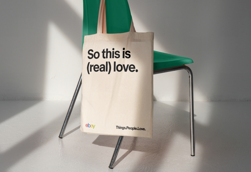
Do follow our logo and tagline lockup guidance when placing both elements on the same side.
Don’t rearrange the logo and tagline lockup arbitrarily.
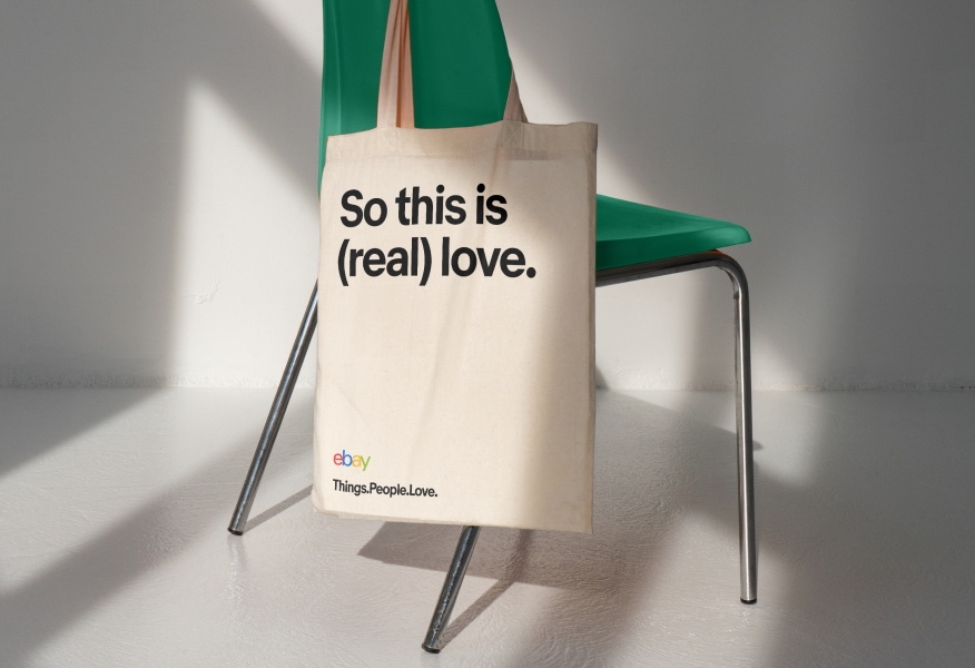
Do set our tagline according to guidance in Market Sans Bold.
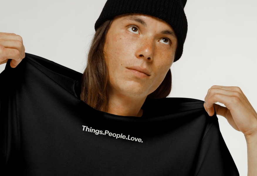
Don’t set our tagline in anything other than Market Sans Bold.

Do include the logo as a standalone piece, especially in multipiece sets.
Do not place the logo on small items, like stickers, if another item in the set already features it.
Do set lines in a single size, either left- or center-aligned.
Don’t alter sizes or stagger type.
Do ensure that all graphics are aligned to Evo’s flat, graphic style.
Don’t introduce visual effects like 3D, gradients, or drop shadows.
Do limit your color palette to a single family per item and keep UI designs true to product experience.
Do not introduce color to iconography, alter the colors of UI elements, or use our heritage colors arbitrarily.


Logo
Learn how to use our logo across product and marketing applications.

Typography
Learn how to use our typography across product and marketing applications.
Color
Learn how to use our color across product and marketing applications.

Iconography
Learn how to use our iconography across product and marketing applications.