A technical dive into some of the animation techniques we used to bring Playbook’s homepage to life
Animating Playbook
Jul 15, 2025
Jul 15, 2025
A technical dive into some of the animation techniques we used to bring Playbook’s homepage to life
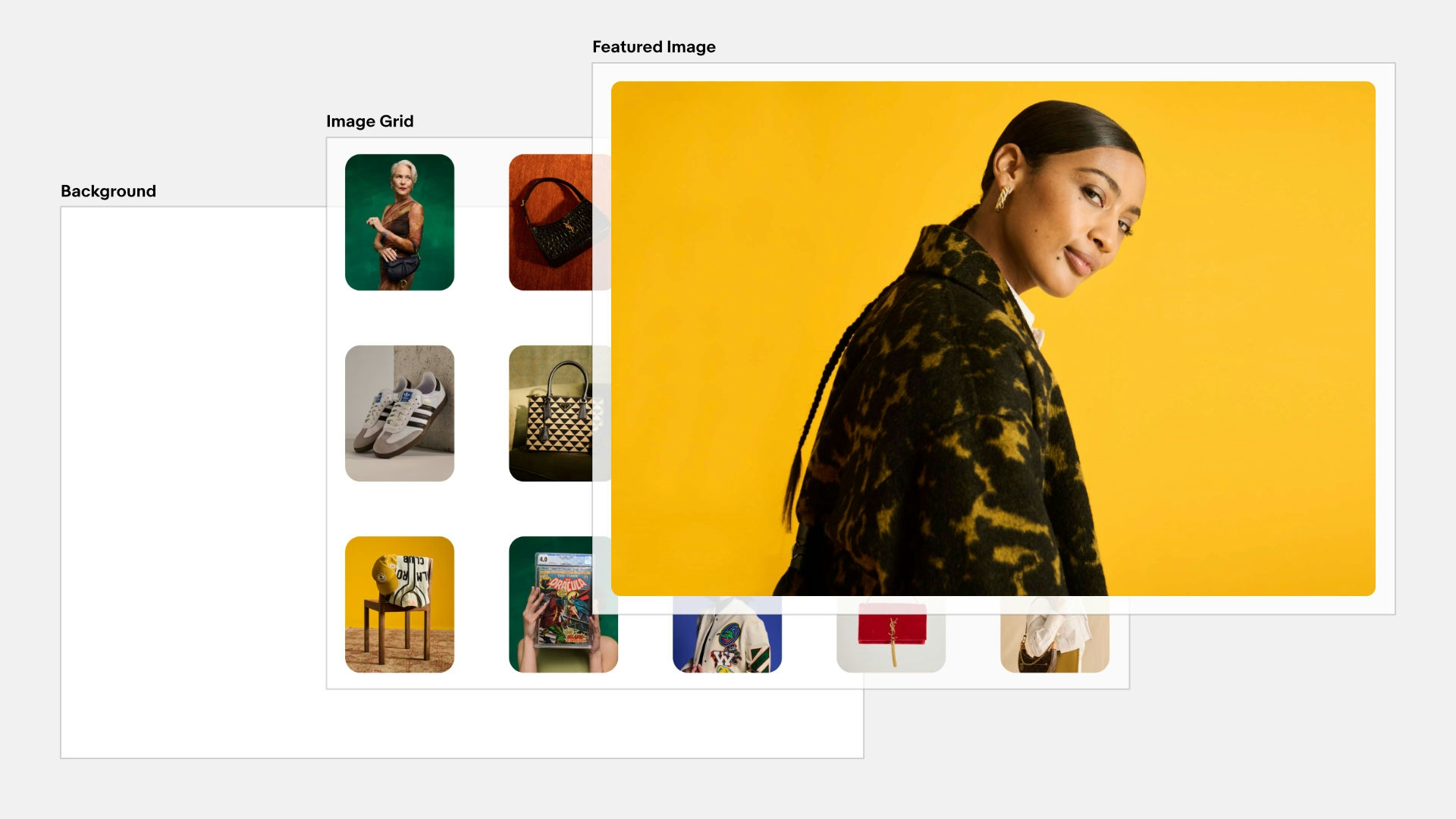
Our image grid has two layers, which are stacked to appear as a single element
We set up our grid using relative widths to make size calculations easier when animating
At the end of last year, our OneExperience team officially launched eBay Evo, an evolved brand and design system that spans all of our company’s experiences and initiatives from product to marketing. As part of that launch, we introduced Playbook—a comprehensive guide that unpacks the design principles and implementation details of the system across more than 280 pages, 2,700+ explanatory images and videos, and a variety of interactive tools.
We knew that for Playbook to make an impact, it couldn’t just describe our core principles—it needed to embody them. From user interaction and tone of voice to illustration and visual design, we wanted the site to bring these ideas to life and make them compelling and easy to understand.
If I had to identify one of these principles that I focused on most while building Playbook, it’s motion. At eBay, we believe that motion—when used intentionally—can elevate brands and products and create effortless, engaging experiences. Our team wanted to make sure that Playbook had these qualities as well, and perhaps nowhere is this goal more apparent than on the homepage. From top to bottom, Playbook’s homepage is rich with animated and interactive elements designed to grab your attention, highlight key messages, and entice you to engage and explore the site further.
From an engineering perspective, many aspects of the homepage would be fun to explore in more detail. But if there’s one section in particular that deserves the spotlight, it’s the scroll-driven image gallery animation that sits just below the hero module. It’s probably my favorite moment on the page, and definitely the one that has gotten the most attention since launch. In this article, we’ll break down how we approached and implemented this dynamic, scroll-based animation from both a conceptual and technical standpoint.
Note: if you would prefer to explore the source code for the demos in this article at your own pace, please check out this CodeSandbox.
Before we get into the weeds of this specific interaction, I want to step back and talk through the broader genre of animation we’re attempting to implement: the scroll-driven animation. For the purposes of this discussion, let’s assume that all animations as having three salient components: a trigger, a timeline, and a driver.
Most animations we experience are driven by time. When you sit down to stream a Pixar movie, for example, you trigger the animation by pushing play on your remote, at which point time takes over and marches the animation steadily forward.
However, time is a fungible variable in this equation. In practice, we can use any force at our disposal to control an animation’s timeline. Flip books use kinetic energy as a driver, creating an animation from the force of our fingers flicking through pages (each of which could be thought of as a keyframe in a timeline).
For this animation in particular, we’re going to use the browser’s scroll position as our driver. To do this, we’ll need to identify a specific element on our page and track its position relative to the browser’s viewport. In doing so, we’ll be able to derive a bounded numerical value—a progress value that falls between 0 and 1—which we can then use to control the playback of our animation.
As you can see in the video above, our animation is triggered when the top of the target element meets the top of the viewport and resolves when the bottom of the target element meets the bottom of the viewport. The specific start and end points are arbitrary, but as long as we have some sort of observer in place to track our scroll position, we can use these boundaries to calculate a progress value that we can then apply to our animation timeline.
On Playbook, we’re using Motion for React (formerly Framer Motion) for this task via its useScroll hook. In the future, we’ll instead be able to leverage native CSS Scroll-driven Animations, which come with a number of performance benefits. Until browser support catches up, however, we’ll need to continue to rely on Javascript—and Motion, with its built-in optimizations and approachable API, is my favorite library for the job.
Now that we’ve established a baseline for what we’ll be building, let’s unpack how to put this theory into practice by setting up a scene that we can animate.
First off, we need to define a scroll target that we can use to derive a progress value. Instinctively, you may have keyed in on the featured image, given that it is the most prominent element in our animation. Although it’s a common approach to directly target one of the elements that we are actually animating, in this case, we actually want to target an element that is an ancestor of our image grid instead because:
So, let’s target the <section> that is the parent of our image grid. To make this work, we need to set its height to 200% of the height of the viewport (200vh/svh). The exact height we use is arbitrary, but to my eye making it 2x the viewport gives us enough runway to play through the animation at a speed that feels natural. This implementation also has the side benefit of making the animation responsive by linking its duration directly to the size of the device.
With that in place, we can now leverage Motion for React to calculate our scroll progress, which we can then use to drive our animation’s playback:
One final step we need to take before we start slinging elements around is setting up our image grid. Although it may look like a single element, in practice, the grid is a stack with two layers: a featured image layer that sits above an image grid layer. We can use some sleight of hand to make these two layers appear as one by positioning one layer on top of the other. And because we want the animation to play out as our target element scrolls through the viewport, we’ll need to "fix" them in the center of the viewport for the duration of the animation timeline.
Because of the specific start and end points we’ve chosen, the simplest way to achieve this effect is with a sticky element that contains two absolutely-positioned child elements, all of which are sized to fill the full width and height of the viewport.
At this point, animating the featured image element may seem simple. All we need to do is reduce its width and height over the duration of our animation timeline, right? While determining the initial dimensions is in fact that straightforward—just calculate the width and height of its parent element—the challenge lies in figuring out what its final dimensions should be.
To calculate the image’s final dimensions, we need to know the width and height of the images in the grid at the end of the animation. However, since we're also transforming them during the animation, we can't simply derive these values from the elements themselves. Instead, we'll need to be strategic about how we implement the image grid.
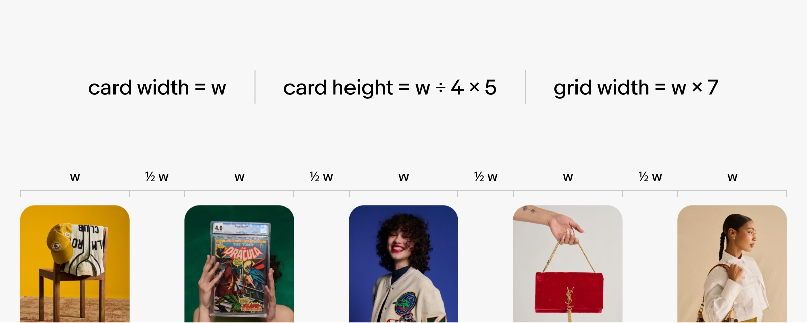
If we make the width of the image grid the same as the initial width of the featured image, and we make the gutters between the images a simple fraction of the width of one image, calculating the final desired width becomes almost trivial.
For this animation, I decided to make each gutter half the width of one image. On desktop views of the site, for example, you have 5 columns with 4 vertical gutters. This means that the final width of each image can be calculated by dividing the total width of the grid by 7 (i.e., 5 columns + 4 gutters × 0.5). And since we've also intentionally set an aspect ratio for our images (4:5), the final height can be derived from its final width:
Simply scaling the image linearly from the start to the end of the animation, however, felt somewhat boring. To fix this, I added an additional keyframe halfway through the timeline. At this keyframe, the featured image locks into its final aspect ratio at a scale that is twice that of its final size. Thanks to Motion’s useTransform hook, we can set these keyframes relative to our scroll position with a couple of additional lines of code:
Because the return value of these Motion hooks is a motion value rather than a native data type, we also need to use a motion component to apply the styles to our featured image:
If you’ve made it this far, we’ve discussed everything you need to know from a conceptual standpoint to finish this animation. However, there are still a few nuances specific to the image grid that are worth touching on before we close.
The first thing I want to highlight is an organizational and layout decision: the image grid is actually one big inline SVG. Because of some of the unique characteristics of SVGs, this allowed us to offload a meaningful amount of the layout logic onto the SVG itself. It’s true that you could achieve a similar outcome using CSS Grid—especially if your target browsers support CSS Subgrid—but I call it out specifically because this is a practical and valid use of SVG that I don’t see talked about often.
The second thing I want to spotlight is more about performance and code simplification. Within the image grid, we segmented the images into three groups based on their position in the grid: one for the two outer columns, one for the center column, and one for the two in-between columns, each of which are color-coded in the video below. This means that we could animate the scale and opacity of each group—rather than each individual element—using the same keyframe-based approach we discussed earlier to delay their animations until halfway through the timeline:
That’s the basics of the scroll-driven animation featured on the Playbook homepage. In order to keep these demos focused and digestible, I’ve tried to reduce these code samples to their most basic form. Necessarily, I’ve omitted key considerations that are built into the final experience, like responsive design and respect for users’ motion preferences. That said—and I cannot emphasize this enough—if you want to implement a similar experience on your own site, it’s critical that you do not neglect these concerns.
Like I mentioned at the top, if you want to check out the code for these demos in full, you can do so at this CodeSandbox link.
Enjoy!
An isolated view of the image grid that we will be animating in this article
A visual explanation of scroll-driven animations (source code)
If we know the initial and final sizes of our featured image, we can interpolate between them (source code)
Animating groups of images to create the illusion of depth (source code)
Note: the code above references a custom hook, useMeasure, that calculates the bounding box of a chosen element. For more info, check out the source code.
const scrollTargetRef = useRef<HTMLDivElement>(null)

// scrollYProgress is a number between 0 and 1
const { scrollYProgress } = useScroll({target: scrollTargetRef,
    offset: ['start start', 'end end']
})
const initialWidth = featuredRect.width;
const initialHeight = featuredRect.height;
const finalWidth = initialWidth / 7;
const finalHeight = finalWidth / 4 * 5;
const midWidth = finalWidth * 2;
const midHeight = finalHeight * 2;
// useTransform interpolates the values in
// the 3rd argument based on the scroll progress
// relative to the keyframes in the 2nd argument
const width = useTransform(scrollYProgress, [0, 0.5, 1], [initialWidth, midWidth, finalWidth]);
const height = useTransform(scrollYProgress, [0, 0.5, 1], [initialHeight, midHeight, finalHeight]);// Using the same value for the first two keyframe means that
// the animation appears to start at 50% of the timeline
const opacity = useTransform(scrollProgress,[0, 0.5, 1], [0, 0, 1])
const centerGroupScale = useTransform(scrollProgress, [0, 0.5, 1], [0.725, 0.725, 1])
const middleGroupScale = useTransform(scrollProgress, [0, 0.5, 1], [0.575, 0.575, 1])
const outerGroupScale = useTransform(scrollProgress, [0, 0.5, 1], [0.425, 0.425, 1]).scroll-target {
height: 200vh;
.sticky {
position: sticky;
top: 0;
overflow: hidden;
height: 100vh;
& > div {
position: absolute;
top: 0;
left: 0;
width: 100%;
height: 100%;
}
}
}const [featuredRef, featuredRect] = useMeasure();
const initialWidth = featuredRect.width;
const initialHeight = featuredRect.height;
const finalWidth = initialWidth / 7;
const finalHeight = finalWidth / 4 * 5;const width = useTransform(scrollYProgress, [0, 0.5, 1], [initialWidth, midWidth, finalWidth]);
const height = useTransform(scrollYProgress, [0, 0.5, 1], [initialHeight, midHeight, finalHeight]);
<motion.img style={{ width, height }} />